Typographic chair
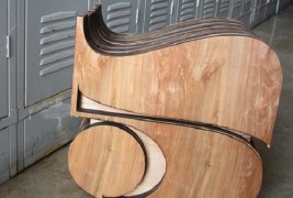
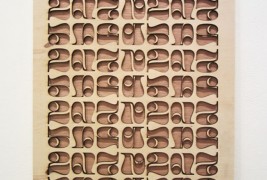
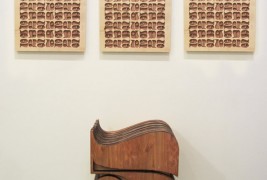
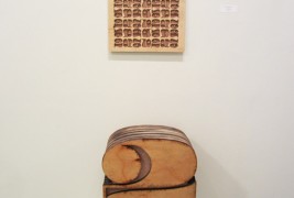
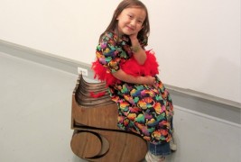
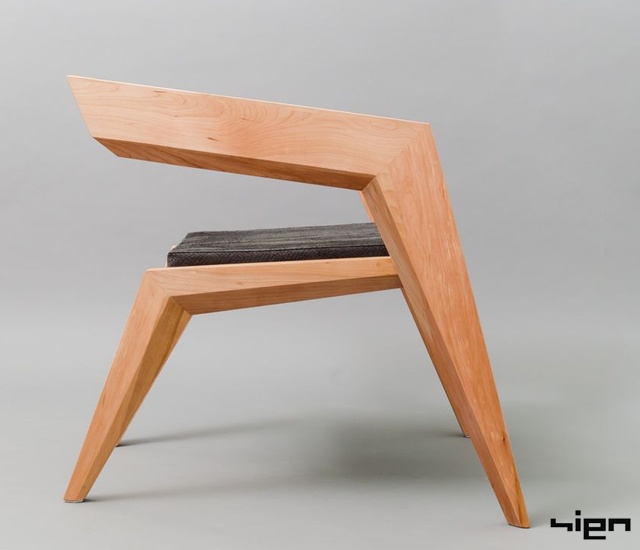
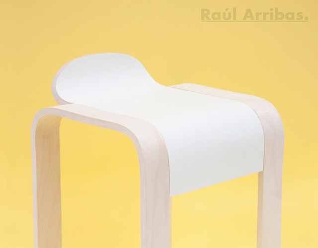
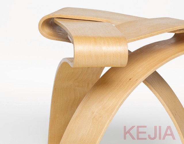
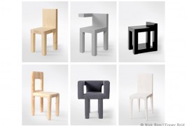
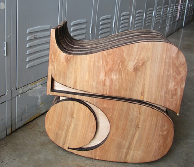
Oct 22 2013, 12:30 pmI came across the Typographic Chair Design by award-winning graphic designer Stephanie Bullock and thought I’d share it with you. I loved the design the moment I saw it. The concept behind the project is an exploration of how the numbers 2 and 5 resemble each other in terms of their shape. I hadn’t noticed before how a 5 can resemble an upside down 2 or how something as mundane as a number can embody such clean, simple beauty through the way they are drawn or designed. The chairs are made with layers laser-cut pine and they stool size standing 18 inches high. I particularly like the way the top of the number five chair can fit the curve of a human body and it’s great to see the art of typography transformed into three dimensions as furniture. I think that Stephanie’s designs are fun, whimsical and they’ve inspired me to think about numbers in a whole different way.
Designer: Stephanie Bullock
Tags: chair craft creative design designer font furniture graphic wood
Comments
Next & Previous article
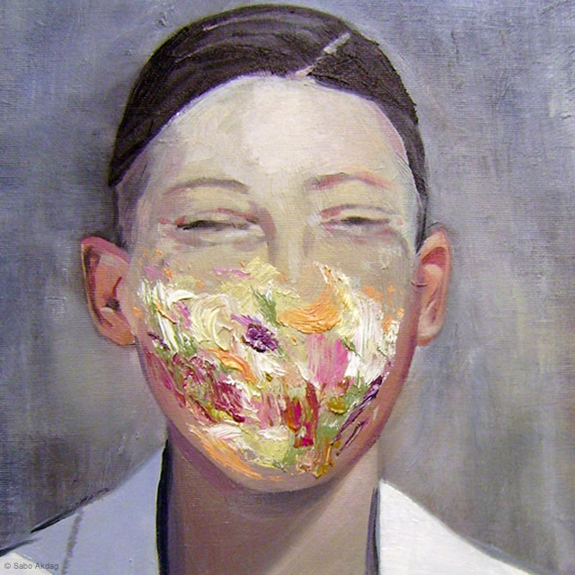
Painting by Sabo Akdag
Oct 22 2013, 2:30 pmThe works that I show you today are taken from the series "P/01" and "P/02" [ ... ]
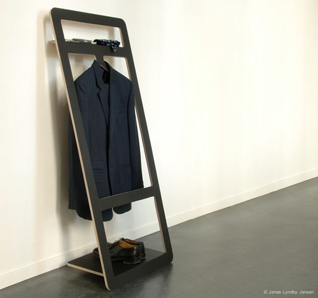
Suitable valet stand
Oct 22 2013, 10:30 amSuitable, the coat stand with minimalist design created by the Danish designer [ ... ]

