Material Teddy
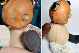
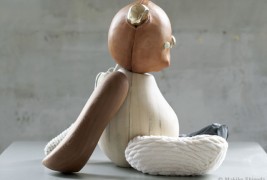
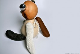
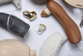
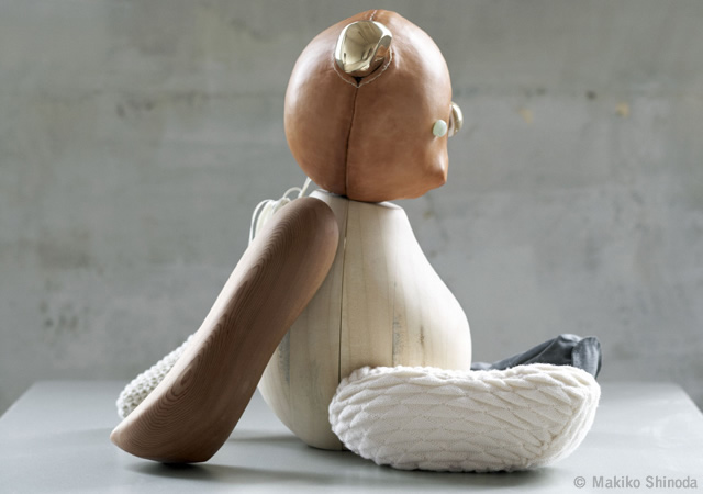
Nov 24 2011, 10:00 amIs there a more iconic shape that triggers our childhood memories than a teddy bear? I don’t think so. And indeed it is something that doesn’t need to be redesigned – it is just perfect! But designer Makiko Shinoda found a way to add a little something without modifying the shape: she used different materials. Her description of the project’s concept is just perfect, so here it is: “The landscape of modern society finds us increasingly disconnected from a rich sensory experience. Smells, sounds, colours and textures are standardized, categorized and controlled in urban life; thereby eliminating all the subtle nuances and richness that exist in the nature. This contributes to a lack of imagination, communication, and spatial perception. How can we engage and stimulate our senses in our daily lives? My point of view for design is to create a sensory experience for urban life to develop the nervous system by stimulating the brain through interaction with sensory inputs.” Basically, Material Teddy is made from different materials, therefore different textures. This is such a simple change, but I think the result is amazing! It is much more interactive and thought provoking. Beautiful!
Designer: Makiko Shinoda
Tags: aluminium creative design designer fabric innovative leather toys wood
Comments
Next & Previous article
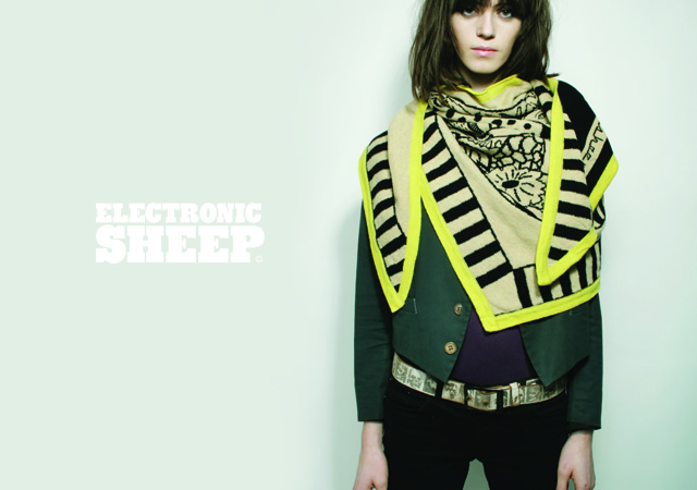
Electronic Sheep fall/winter 2011
Nov 24 2011, 12:00 pmLet's subvert the rules of winter. Let's pretend it's no longer dark, gray [ ... ]
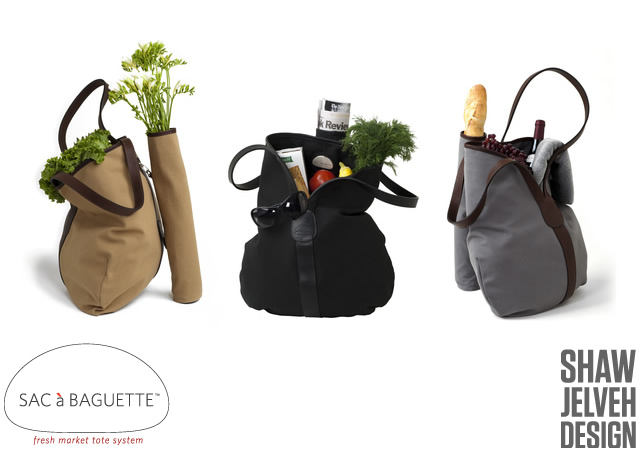
Sac a baguette
Nov 24 2011, 12:00 amA simple and functional idea by the designers from Shaw Jelveh Design studio. [ ... ]

